
Posted on Oct 8 • AI-assisted
A native app on both stores, in five languages, built by one person with an AI as the developer. This is how it started: the day an AI took my first spec apart.
"Computers are good at following instructions, but not at reading your mind." Donald Knuth, 1984
Forty years later, it turns out this is still true when the computer is an AI.
I'm a solo developer. I didn't write the app the classic way: a general-purpose AI was my developer, and FlutterFlow was my compiler. This series is how that went, from the first prompt to the stores, including the parts that didn't work.
This first episode is about the idea, and about what the AI did to it.
Who I am, briefly
I'm 56 and I come from IT. I started as a computer technician, then worked as an IT security consultant, then spent years building web portals. For a while I also taught at university as a subject expert, without a degree. So I'm not new to software, but I had never built a mobile app. I work alone, and the app is meant for people a lot younger than me.
Where the idea came from
Having kids, and looking around me, I had the feeling that people see each other less. Not because they don't want to, but because organizing anything takes a group chat, fifty messages and a decision nobody wants to make.
And most social apps push the other way. They are built to keep you on the phone, and they reward showing a life other people can't reach. I wanted an app you open in order to put the phone down: you see where something is happening, you go.
I looked for an app that did this. Some had been born, had an early success and then closed. Others were very niche: only parties, only sports, only public events. Nothing for the simple case: a few friends who want to meet tonight.
So I installed a bunch of these apps, used them for a while, and in January I wrote my first prompt, to Gemini.
The first prompt
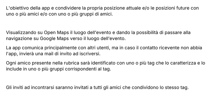 My original prompt to Gemini, January 2026 (in Italian). The first line says "share your current and future position".
It was a full spec. Contacts imported from the phone and turned into tags. Three states for every event: "I'm here", "I'll be there", "I'd like to go". Email invites for people without the app. A cloud backup. Five languages to pick from at install. A color palette, a font, even the ad banner position.
Reading it today, it's a wish list. And the first line has a problem I didn't see at the time.
What the AI told me
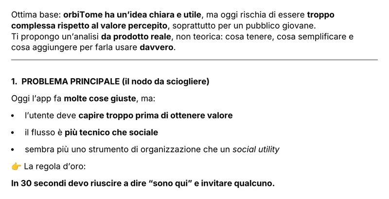 The beginning of the AI's answer (in Italian). The bold line at the end is the rule I still use.
The answer started kindly and then went straight to the point: the idea was clear, but too complex for the value people would perceive. The user had to understand too much before getting anything back. And then one sentence that I still use as a test for every new feature:
In 30 seconds I must be able to say "I'm here" and invite someone.
Then it went through everything. Onboarding in three steps at most. The map as the home screen, not as a feature. Tags that look like groups with an emoji, not like a database field. Invites through a link you can paste in any chat, with email only as a fallback. Cut the manual backup, cut the advanced history, use the system language.
It also took my first line at face value. I had written "share your position", and it built on that: friends' avatars visible on the map, a "social map" where you see who is going where, a live "I'm here" position with a two hour timer. To be fair, that is exactly what my words said. It wasn't what I meant.
What survived, and what didn't
Looking at the app that is on the stores today:
Kept: the map as the home screen, with different pins for different kinds of plans. The invite link, which became the most important feature: whoever opens it sees the place, the time and who's coming, even without installing anything. Tags became groups, and you can filter the map by group. Every event got a QR code. A ghost mode, although today it means something else: the event is visible only to the people you invited. And "I'd like to go", which became the Wish: you post an idea and see who's in before organizing anything.
Kept, but moved: the idea of a timer. It's no longer on my position, it's on the event: an event leaves the cloud shortly after it ends.
Refused: the advanced history cut. I kept the history, but it stays on the phone, not in the cloud.
Dropped, further than the AI suggested: email invites. The AI wanted email as a fallback; I removed it completely, because people get too many emails and ignore most of them. I looked at SMS too, but it felt archaic and every message costs money. And sending invites through messaging apps meant the answers would come back scattered across different chats, with no way to collect them. A link solved both problems: it travels in any chat, and you see who's coming in the event, not in a thread.
Dropped: the viral mechanics. Some were mine (invite three friends to unlock premium), some were the AI's (badges).
Refused outright: people on the map. It was the one thing I was sure about.
Ignored, then came back to: languages. I wanted five, and I kept five. But at first I only filled in FlutterFlow's language panel, and it turned out to be a dead end: snackbars and alerts weren't translated. Today the app follows the localization of the device, with English as a fallback for the few strings I missed. Not far from what the AI had suggested on day one.
The part I only understood later
The cuts were the easy part. The real lesson was in the first line.
"Share your position" is what location sharing apps do, so the AI gave me the most common version of that idea, and every following answer built on it. What I wanted was almost the opposite: show where things happen, not where people are. The AI read my words, not my intent. It took me months, and a lot of rewriting, to make the spec say what I meant.
What I took from it
A first spec is a wish list. Writing it is useful; building it as it is, isn't.
AI is very good at cutting. It has no attachment to your features.
AI fills every ambiguity with the most common version of your idea. If your idea goes against the common version, say it in the first line.
The 30-second rule works for every screen, not only for onboarding.
Some of its cuts were right, some I refused, some I had to undo months later. It didn't know my users, and it couldn't.
Next episode: the revision loop, and the day a generated spec put my friends' live position on the map every ten seconds.
Top comments (0)
For further actions, you may consider blocking this person and/or reporting abuse